I was told by my advisor in undergrad that if you really understand something you should be able to explain it so that everyone can understand. I was a chemistry major so he was basically telling me to explain concepts so that someone without a science background would be able to understand.
This has always stuck with me and is probably the reason I dropped out of medical school – I had a real issue with the medical field intentionally over complicating simple things. I would sit in class thinking “this is a really basic concept and if they would explain it to people in simple terms we would all be heathier!” – I digress…
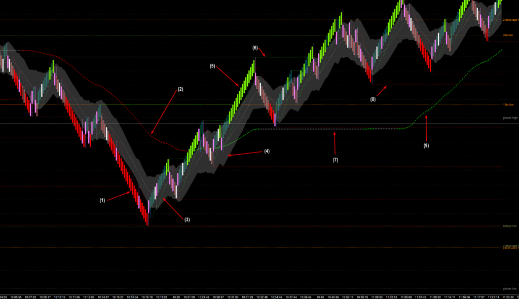
The above image is a trading system I started working on in 2011. When I first started using the original version I considered myself a bricklayer. I would come to work and just repeat the same process over and over and over and over. I was pretty successful doing this but for some odd reason I did not have the discipline to stick with it. I would attend a seminar, read a book and see that joe blow was making 10x what I was making so let me incorporate Joe Blows trading into my trading. The result was always a losing streak that led to a blown account.
Over the past decade I have tried many strategies, but when I get tired of losing I always revert back to a mutation of my original Matador Scalping Strategy.
So what I am going to attempt here is to outline what I am doing in a manner that ANYBODY can understand. If I fall short, please let me know so I can improve my own understanding of my trading system.
Lets begin by identifying all the weird thangs that make up my chart!
For starters, I use Sierra Chart. It has a steep learning curve but I have found it to be the most stable rock solid customizable platform on the planet. It never crashes or chokes and you can make it do anything any other platform can do. I strongly urge ant trader serious about doing this thing for income to consider Sierra Chart.
Next. I do not use time based charts. I use Sierra Chart’s Flex Renko set to 22-16-0 which I have found to be ideal settings for the only vehicle I trade – the Nasdaq 100 Futures.
Lets jump head first into the chart.

- Bright red candles signify strong short term selling dominance as price has moved outside of the Keltner Channel. This is where I want to be in trades to scalp short.
- ADXMA – Average Directional Index Moving Average (45). When red, I am only looking to sell.
- GANN HiLo Activator. Short term trend indicator. I also use as a trailing stop.
- Keltner Channel. I only initiate trades when they are outside of the channel.
- Bright green (LIME) candles signify strong short tern buying dominance. This is where I want to be in long trades.
- Swing High – short term swing high (or fractal high)
- ADXMA – Flat and Grey means the market does not have the energy for the preferred quick clean entries.
- Swing Low – short term swing low (or fractal low)
- ADXMA – Green means its ok to take long entries.
It looks like a lot, but it is what I need to make quick decisions for quick clean market scalps.
In future posts we will start to look at both good and bad entries. I will probably post more of the bad entries as I tend to learn more from the bad ones.
Until then, feel free to ask any questions and if you use Sierra Chart reach out for the chart template.
Leave a Reply